Post-processing Workflow - Standard Flow
Most photographers have their own ideas about how to process their images after capture. It is a very subjective matter where the photographer attempts to apply techniques which will enhance the artistic attraction of an image making it pleasing to the eye and imparting a story of some sort to the viewer. This artistic side includes areas like cropping, dodging and burning, cloning and vignetting.
At the same time, the process needs the application of certain technical steps which will improve the quality of the photograph in terms of things like exposure, contrast, sharpness.
Invariably there is an area where the artistic and the technical combine. For example, getting the 'right' white balance can be a question of correcting a failing of the camera but also applying a subjective adjustment to hopefully improve the colour balance of the image in the eyes of the viewer.
Before starting on any of this it has to be said that there is nothing better than getting the shot right 'in camera'. The less you have to do in post, the better. Also, if the image coming out of the camera is blurry or highlights are blown out or the framing of the image does not encompass the vista the photographer was trying to capture, then no amount of work in post processing will remedy the situation.
Part of the reason that there are so many variations in workflow is that there are so many ways to do near enough the same thing. It is not an overstatement to say that within Photoshop alone, there are probably 6 or 7 methods of carrying out some of the more common adjustments to achieve a particular effect. There is no right way or wrong way. The one that works for you and produces the best result in your opinion is the right one FOR YOU and that's all that matters. Then there is the choice of software, both in terms of RAW conversion programs and main development software. It is not my intention to compare these and recommend one over the other. I will merely state what I use and how I use it. Nor will I try and detail everything that can be done - only the items I tend to use more often than not. I will therefore not be covering the stitching of images for panoramas or mono conversion or focus stacking or a myriad of techniques that might be applied to a limited range of images. The workflow I will outline below is the one I use for the majority of my landscape/architectural shots. In setting out my workflow, I have to assume that there is a basic understanding in the reader of how to find their way around the software. When I use a tool, I will not describe every possible option in the settings. There are many videos out there which will do this. This is my workflow, not a comprehensive course on how to use every aspect of Camera RAW or Photoshop.
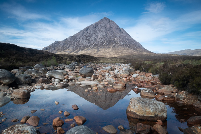
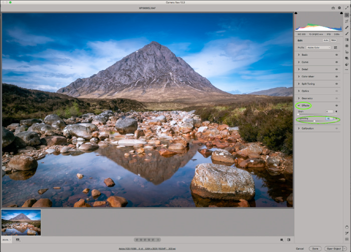
The image I will use starts out as :-
At the same time, the process needs the application of certain technical steps which will improve the quality of the photograph in terms of things like exposure, contrast, sharpness.
Invariably there is an area where the artistic and the technical combine. For example, getting the 'right' white balance can be a question of correcting a failing of the camera but also applying a subjective adjustment to hopefully improve the colour balance of the image in the eyes of the viewer.
Before starting on any of this it has to be said that there is nothing better than getting the shot right 'in camera'. The less you have to do in post, the better. Also, if the image coming out of the camera is blurry or highlights are blown out or the framing of the image does not encompass the vista the photographer was trying to capture, then no amount of work in post processing will remedy the situation.
Part of the reason that there are so many variations in workflow is that there are so many ways to do near enough the same thing. It is not an overstatement to say that within Photoshop alone, there are probably 6 or 7 methods of carrying out some of the more common adjustments to achieve a particular effect. There is no right way or wrong way. The one that works for you and produces the best result in your opinion is the right one FOR YOU and that's all that matters. Then there is the choice of software, both in terms of RAW conversion programs and main development software. It is not my intention to compare these and recommend one over the other. I will merely state what I use and how I use it. Nor will I try and detail everything that can be done - only the items I tend to use more often than not. I will therefore not be covering the stitching of images for panoramas or mono conversion or focus stacking or a myriad of techniques that might be applied to a limited range of images. The workflow I will outline below is the one I use for the majority of my landscape/architectural shots. In setting out my workflow, I have to assume that there is a basic understanding in the reader of how to find their way around the software. When I use a tool, I will not describe every possible option in the settings. There are many videos out there which will do this. This is my workflow, not a comprehensive course on how to use every aspect of Camera RAW or Photoshop.
The image I will use starts out as :-
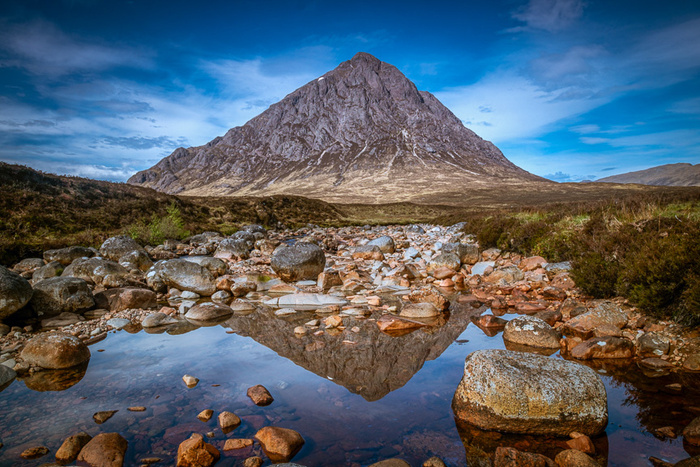
and ends up as :-
So here we go.
I shoot all my landscape images in RAW, capturing much more data and dynamic range than the JPEG image can hold. I therefore have to initially load the image into RAW conversion software. I use Adobe Camera Raw. In truth, this is only because I use Bridge to catalogue my files separately and have gotten used to it. Lightroom performs the cataloguing and RAW conversion in one package and is preferred by many photographers. In essence the processing available is identical, as Camera RAW and Lightroom use the same processing engine. Let me say at the outset, the version of Camera RAW I use is the one bundled with the full version of Photoshop. The version that comes with Elements is missing a significant number of tools and functions.
Crop and Straighten
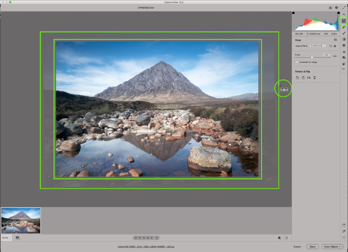
Once the image is loaded, the first thing I do is crop and straighten, if needed. Ideally I will have this right in camera, but sometimes it is only when the image is viewed after capture that I decide that cropping and/or straightening is needed. It might even be the case that I had a particular crop in mind when I took the shot (eg square). Bear in mind that doing either of these reduces the pixel count of an image and thereby its quality.
Straighten is self-evident, but be careful not to use what you might think is a straight line (eg the far shore of a lake)which actually has a genuine slope to it in the image because of perspective. The main reasons to crop are (a) to remove unwanted objects as long as it does not upset the balance of the image, (b) to remove 'dead' areas or uninteresting edges of the image. If they are in the top or bottom of the image, then crop to a more panoramic aspect ratio. If they are to left or right, then crop more square.
Basic Panel
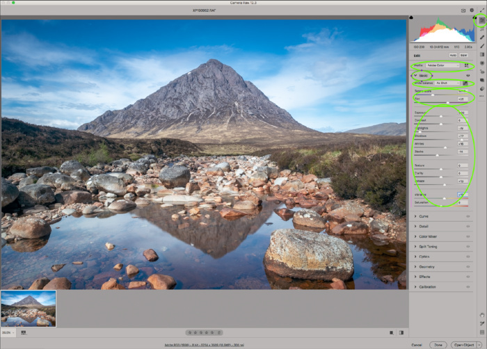
Profiles
I might run through the Profiles available to see if I can improve the starting point, but most often I will leave the default setting of Adobe Color. The options available will differ depending on the file type (eg RAW or JPG) and the camera make.
White Balance
I adjust the White Balance, again if needed, using the Temperature and Tint sliders. Sometimes the camera can be fooled into trying to 'correct' what it perceives to be a white balance error. Sometimes I might want to apply an adjustment which I feel is artistically more pleasing. Again, applying a preset (eg 'Daylight') might be a good starting point. A third method is to select the white balance eyedropper and click on an area of the image which is white, black or grey without any tint.
I then work down the rest of the sliders as follows :-
My first adjustment is to reduce the overall contrast in the image by reducing the Highlights and lightening the Shadows. As I am working with the RAW file, there is much more data to play with and details can be recovered in highlights and shadows much more than would be the case with the JPEG file. The image at this stage will be quite flat, but the point here is to give you control over the contrast in the picture later on in the process.
I will then decide whether or not any adjustment is needed to Exposure. Very often this will be a slight movement to the right, but just as often there is nothing needed.
Contrast again might need a slight adjustment, but using the Tone Curve adjustment (or even the Levels adjustment in Photoshop proper) gives more flexibility. I will speak of these later.
Adjusting Whites or Blacks can be useful where Highlights and Shadows adjustment have not gone far enough or if you want to 'fine tune' the shape of the histogram. Hold the ALT key (Mac) as you move the sliders. The image will turn black for Whites and white for Blacks. As clipping starts to occur some colour will start to appear. Reverse the slider until those colours disappear again. The histogram should now be sorted.
Texture, Clarity, Dehaze and Vibrance all tend to get a slight adjustment to the right. Dehaze is the one where the adjustment is most severe, so use with care - although sometimes a severe adjustment is what is needed! Also, I pay attention to high contrast areas of the image as I adjust Clarity slider, as pushing this too much to the right can create ghosting. Bear in mind, ghosting can occur because of over-zealous use of other contrast tools and this can be corrected by moving the Clarity slider to the left. Keep an eye on the histogram to ensure that no clipping has been created.
Once all the above have been adjusted, have a look at the overall Saturation. It may well have increased as a result of other adjustments - particularly Contrast - so it may need to be reduced a little.
Through each of the above steps, keep an eye on the histogram and ensure that there is no clipping at either end.
Tone Curve
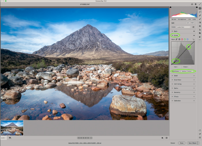
This is all about creating the best global contrast in the image. The classic adjustment is to go for a very slight 'S' curve, but the right answer for you will be very subjective, and in some instances even a reverse 'S' might be necessary. A good starting point is to select the 'Point" tab, then the 'Medium' Curve.
Detail
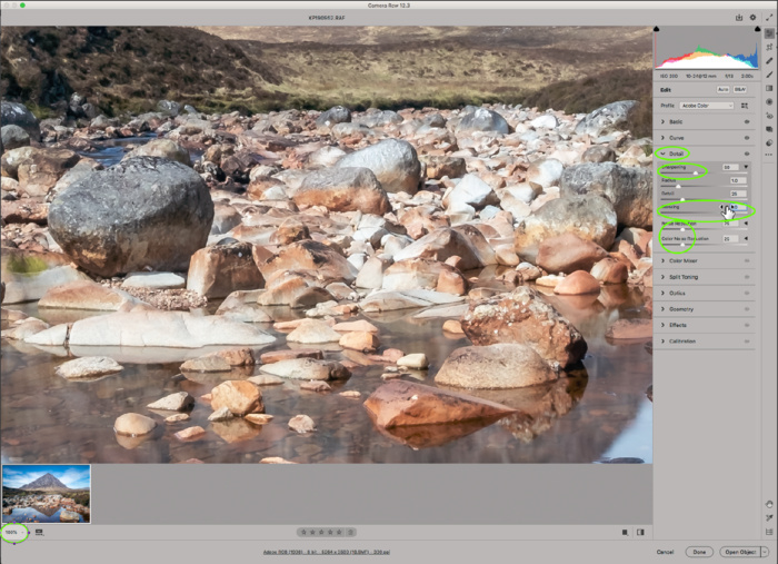
As a Fuji shooter, I leave Sharpening and Noise Reduction until I get into Photoshop proper, so I reduce the Amount and Color sliders to zero. Those with other camera makes, start with the defaults and adjust to taste. It is good practice to zoom in to 100% for this adjustment as it will allow you to see the effect better. It is good practice to apply a mask to the image so that only the edges you want to sharpen have the sharpening applied. Hold the Alt key and move the Masking slider to the right. The image will turn black and white. Very often, a setting of 80 to 90 produces the desired effect and keeps sharpening artefacts to a minimum. Photoshop proper has an extensive array of sharpening options.
Color Mixer
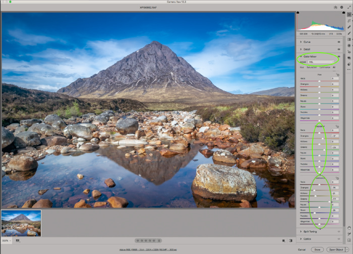
This panel gives a lot of flexibility in adjusting the Hue, Saturation and Luminance of individual colours in the image. I would tend to use Luminance more than the other two. In particular, for landscape shots, I would tend to reduce the Blues slider a little. This will improve the saturation a little and can also help bring down the sky's brightness level. Similar adjustments to Yellow and Orange sliders can reduce the intensity of bright lights/sunlight, whereas increasing them can add intensity to autumn colours.
Split Toning
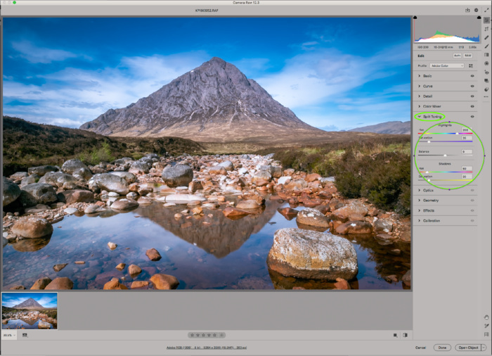
This is a panel I use sometimes but not always. When I do, I would tend to go for a standard Highlights Hue - 260, Saturation - 20, Shadows Hue - 60 and Saturation - 20. I usually leave Balance at 0. Any adjustments here are purely a matter of personal taste. The overall effect is a small increase in colour contrast.
Optics

Again as a Fuji shooter, I have no need to use this panel, as profile corrections etc are carried out in camera. Other brands will need the Remove Chromatic Aberation and Enable Profile Corrections to be ticked, making sure the profile is for your camera and lens.
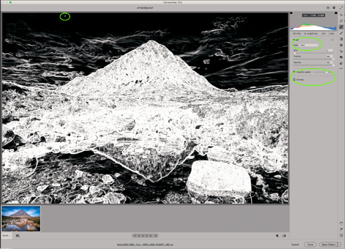
Effects
I tend not to use any Grain adjustment, but very often add a little Post Crop Vignette as a matter of taste.
The remaining panels (Calibration, Presets and Snapshots)are very rarely used.
Spot Healing Brush
This is useful to clean specks and unwanted small objects. I prefer to use the similar tool in Photoshop. However, this version has a neat function which avoids having to spend a lot of time searching for those pesky spots.
Select 'Visualize Spots' (the image turns black and white) and adjust the slider so that the spots are clear and separated from the rest of the image - usually the slider is close to the left.
Select the brush, select 'Heal' as Type. Adjust the Size slider so that the brush just covers the spot to be removed. Once you have selected a spot, you can move the area to be cloned so that it is clean.
Graduated Filter, the Radial Filter and the Brush. They all have the same settings, so I will concentrate on the Radial Filter for my examples.
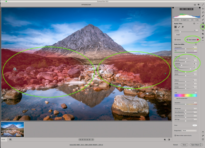
In the above screenshot, I have applied two radial filters to selectively increase the exposure of dark areas at either side of the image. I'm not saying the image necessarily needs this, but I am merely using this to demonstrate what is possible. I have increased the Exposure slider by 0.85. All other sliders available on the Basic panel can be used here. The selected areas of the image can be adjusted by moving the anchor points or using the turn option (hover near the filter area until corner arrows appear).
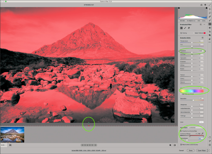
A very useful function within these tools is shown above. Select a filter previously created. Scrolling to the bottom of the Filter panel exposes the Range Mask. By setting this to Luminance, and ticking the Virtual Luminance Map, you can - by using the Luminance Range and Smoothing sliders - better define the area to be affected by the filter. This is a handy tool and goes some way towards replicating the Luminance Masks marketed quite widely.
Once a filter has been created, or a brush adjustment made, there are options to edit the sliders and add to or remove from the area originally set.
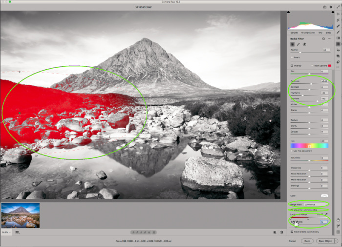
Another 'trick' which I sometimes find useful - and this relates mainly to the Graduated Filter - is to have the starting point and finishing point of the filter BOTH below the bottom of the image, so that initially all parts of the image are affected equally by the filter. Then make the adjustment you are after - in this case I have increased Saturation and altered the Colour of the filter so that it adds a slight magenta tint to the image. I am not saying these are desirable here, but they are being done again to demonstrate what is possible. I then set up a Luminance Range Mask and move the Range and Smoothness sliders so that the highlights for the whole image are selected.
The benefit of doing this is that you are in control of what parts of the total image are affected, whereas in the Basic Panel, the program chooses what it defines as Highlights, Shadows etc.
From here I would then go into Photoshop proper, but before doing so, I would have another look at the image and its histogram and assess whether I need to go back to any of the panels or tools to fine tune or add adjustments.
I shoot all my landscape images in RAW, capturing much more data and dynamic range than the JPEG image can hold. I therefore have to initially load the image into RAW conversion software. I use Adobe Camera Raw. In truth, this is only because I use Bridge to catalogue my files separately and have gotten used to it. Lightroom performs the cataloguing and RAW conversion in one package and is preferred by many photographers. In essence the processing available is identical, as Camera RAW and Lightroom use the same processing engine. Let me say at the outset, the version of Camera RAW I use is the one bundled with the full version of Photoshop. The version that comes with Elements is missing a significant number of tools and functions.
Crop and Straighten
Once the image is loaded, the first thing I do is crop and straighten, if needed. Ideally I will have this right in camera, but sometimes it is only when the image is viewed after capture that I decide that cropping and/or straightening is needed. It might even be the case that I had a particular crop in mind when I took the shot (eg square). Bear in mind that doing either of these reduces the pixel count of an image and thereby its quality.
Straighten is self-evident, but be careful not to use what you might think is a straight line (eg the far shore of a lake)which actually has a genuine slope to it in the image because of perspective. The main reasons to crop are (a) to remove unwanted objects as long as it does not upset the balance of the image, (b) to remove 'dead' areas or uninteresting edges of the image. If they are in the top or bottom of the image, then crop to a more panoramic aspect ratio. If they are to left or right, then crop more square.
Basic Panel
Profiles
I might run through the Profiles available to see if I can improve the starting point, but most often I will leave the default setting of Adobe Color. The options available will differ depending on the file type (eg RAW or JPG) and the camera make.
White Balance
I adjust the White Balance, again if needed, using the Temperature and Tint sliders. Sometimes the camera can be fooled into trying to 'correct' what it perceives to be a white balance error. Sometimes I might want to apply an adjustment which I feel is artistically more pleasing. Again, applying a preset (eg 'Daylight') might be a good starting point. A third method is to select the white balance eyedropper and click on an area of the image which is white, black or grey without any tint.
I then work down the rest of the sliders as follows :-
My first adjustment is to reduce the overall contrast in the image by reducing the Highlights and lightening the Shadows. As I am working with the RAW file, there is much more data to play with and details can be recovered in highlights and shadows much more than would be the case with the JPEG file. The image at this stage will be quite flat, but the point here is to give you control over the contrast in the picture later on in the process.
I will then decide whether or not any adjustment is needed to Exposure. Very often this will be a slight movement to the right, but just as often there is nothing needed.
Contrast again might need a slight adjustment, but using the Tone Curve adjustment (or even the Levels adjustment in Photoshop proper) gives more flexibility. I will speak of these later.
Adjusting Whites or Blacks can be useful where Highlights and Shadows adjustment have not gone far enough or if you want to 'fine tune' the shape of the histogram. Hold the ALT key (Mac) as you move the sliders. The image will turn black for Whites and white for Blacks. As clipping starts to occur some colour will start to appear. Reverse the slider until those colours disappear again. The histogram should now be sorted.
Texture, Clarity, Dehaze and Vibrance all tend to get a slight adjustment to the right. Dehaze is the one where the adjustment is most severe, so use with care - although sometimes a severe adjustment is what is needed! Also, I pay attention to high contrast areas of the image as I adjust Clarity slider, as pushing this too much to the right can create ghosting. Bear in mind, ghosting can occur because of over-zealous use of other contrast tools and this can be corrected by moving the Clarity slider to the left. Keep an eye on the histogram to ensure that no clipping has been created.
Once all the above have been adjusted, have a look at the overall Saturation. It may well have increased as a result of other adjustments - particularly Contrast - so it may need to be reduced a little.
Through each of the above steps, keep an eye on the histogram and ensure that there is no clipping at either end.
Tone Curve
This is all about creating the best global contrast in the image. The classic adjustment is to go for a very slight 'S' curve, but the right answer for you will be very subjective, and in some instances even a reverse 'S' might be necessary. A good starting point is to select the 'Point" tab, then the 'Medium' Curve.
Detail
As a Fuji shooter, I leave Sharpening and Noise Reduction until I get into Photoshop proper, so I reduce the Amount and Color sliders to zero. Those with other camera makes, start with the defaults and adjust to taste. It is good practice to zoom in to 100% for this adjustment as it will allow you to see the effect better. It is good practice to apply a mask to the image so that only the edges you want to sharpen have the sharpening applied. Hold the Alt key and move the Masking slider to the right. The image will turn black and white. Very often, a setting of 80 to 90 produces the desired effect and keeps sharpening artefacts to a minimum. Photoshop proper has an extensive array of sharpening options.
Color Mixer
This panel gives a lot of flexibility in adjusting the Hue, Saturation and Luminance of individual colours in the image. I would tend to use Luminance more than the other two. In particular, for landscape shots, I would tend to reduce the Blues slider a little. This will improve the saturation a little and can also help bring down the sky's brightness level. Similar adjustments to Yellow and Orange sliders can reduce the intensity of bright lights/sunlight, whereas increasing them can add intensity to autumn colours.
Split Toning
This is a panel I use sometimes but not always. When I do, I would tend to go for a standard Highlights Hue - 260, Saturation - 20, Shadows Hue - 60 and Saturation - 20. I usually leave Balance at 0. Any adjustments here are purely a matter of personal taste. The overall effect is a small increase in colour contrast.
Optics
Again as a Fuji shooter, I have no need to use this panel, as profile corrections etc are carried out in camera. Other brands will need the Remove Chromatic Aberation and Enable Profile Corrections to be ticked, making sure the profile is for your camera and lens.
Effects
I tend not to use any Grain adjustment, but very often add a little Post Crop Vignette as a matter of taste.
The remaining panels (Calibration, Presets and Snapshots)are very rarely used.
Spot Healing Brush
This is useful to clean specks and unwanted small objects. I prefer to use the similar tool in Photoshop. However, this version has a neat function which avoids having to spend a lot of time searching for those pesky spots.
Select 'Visualize Spots' (the image turns black and white) and adjust the slider so that the spots are clear and separated from the rest of the image - usually the slider is close to the left.
Select the brush, select 'Heal' as Type. Adjust the Size slider so that the brush just covers the spot to be removed. Once you have selected a spot, you can move the area to be cloned so that it is clean.
Graduated Filter, the Radial Filter and the Brush. They all have the same settings, so I will concentrate on the Radial Filter for my examples.
In the above screenshot, I have applied two radial filters to selectively increase the exposure of dark areas at either side of the image. I'm not saying the image necessarily needs this, but I am merely using this to demonstrate what is possible. I have increased the Exposure slider by 0.85. All other sliders available on the Basic panel can be used here. The selected areas of the image can be adjusted by moving the anchor points or using the turn option (hover near the filter area until corner arrows appear).
A very useful function within these tools is shown above. Select a filter previously created. Scrolling to the bottom of the Filter panel exposes the Range Mask. By setting this to Luminance, and ticking the Virtual Luminance Map, you can - by using the Luminance Range and Smoothing sliders - better define the area to be affected by the filter. This is a handy tool and goes some way towards replicating the Luminance Masks marketed quite widely.
Once a filter has been created, or a brush adjustment made, there are options to edit the sliders and add to or remove from the area originally set.
Another 'trick' which I sometimes find useful - and this relates mainly to the Graduated Filter - is to have the starting point and finishing point of the filter BOTH below the bottom of the image, so that initially all parts of the image are affected equally by the filter. Then make the adjustment you are after - in this case I have increased Saturation and altered the Colour of the filter so that it adds a slight magenta tint to the image. I am not saying these are desirable here, but they are being done again to demonstrate what is possible. I then set up a Luminance Range Mask and move the Range and Smoothness sliders so that the highlights for the whole image are selected.
The benefit of doing this is that you are in control of what parts of the total image are affected, whereas in the Basic Panel, the program chooses what it defines as Highlights, Shadows etc.
From here I would then go into Photoshop proper, but before doing so, I would have another look at the image and its histogram and assess whether I need to go back to any of the panels or tools to fine tune or add adjustments.